Stand Out With Signage: Best Practices for Maximum Visibility
3/11/2025
When it comes to communicating with new prospects, your business signage often services as a first impression. Whether it’s your outdoor signage drawing looks from passersby, or a window graphic giving your shop a creative edge – great signage is essential for capturing attention and reinforcing your brand.
But not all signs are created equal. Poor design, bad typography or a color palette that’s hard to read at a distance can reduce the impact of your custom signs. To help you develop signs that truly stand out and get you noticed for all the right reasons, your creative team at Signs Now has prepared some tips for maximizing visibility and engaging your audience.
Key Elements of Eye-Catching Signage
Every sign is different, but here’s a few best practices to keep in mind when wanting to maximize your brand’s visibility:
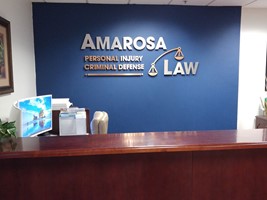
- Choose the right typography: An often-overlooked element of the most successful signage is the choice of font. You’ll want to choose the most readable fonts, which are typically sans-serif options like Arial or Helvetica, for clean and simple legibility. Though your main branding might feature a more decorative or script-like font, these are tough to read at a distance. You’ll also want to limit your typeface choices to just one or two complementary fonts to keep your sign looking clean, professional and uncluttered.
- Maximize color contrast: Color choices are fundamental to ensuring that your signs get attention. High-contrast combinations not only boost readability at a distance, but can make your design pop! For example, black text on a white background, or yellow on a dark blue background, are both easy-to-read combinations. You’ll want to incorporate your brand colors where possible.
- Simplify your message: Generally speaking, when it comes to signage, less is more. Cluttered signs with too much text can overwhelm viewers and reduce overall comprehension. Limit your message to the most essential points: your brand name, tagline and a short call-to-action, such as your web address or an arrow pointing to your entrance. Avoid industry jargon and stick to clear language that your target audience will easily understand, too!
- Location and placement: Where you place your sign matters just as much as its design. A well-designed graphic placed too far from traffic, or obstructed by trees or lampposts, won’t draw the attention it needs. Measure your viewing distance and adjust design elements based on whether your audience will see your sign from a car or from the sidewalk. You also want to follow the natural line of sight – avoid placing anything at an odd angle where a passerby’s field of vision won’t see it!
- Consider lighting: Illumination can make or break signage visibility, especially for outdoor options like pylon or monument sign designs. A strategically lit sign increases your visibility at night and during poor weather conditions. Whether you go with backlighting, LEDs, spotlighting or something else, you’ll still want to ensure you test the lighting at different times of day.
Now that you’re equipped with these best practices, it’s time to take the next step. If you need to brainstorm creative outdoor signage design ideas, Signs Now has you covered. Partner with us for a custom solution that captures attention no matter where you need it!
Looking for custom sign or graphics option?
Back